Charma (FKA WorkPatterns)- acq by The Predictive Index
First time experience
Access shipped product
Overview
Our first attempt at re-designing our onboarding focused on addressing our low retention rate. As an experiment we brought certain actions to the forefront (e.g. inviting team members). This proved to be our most successful onboarding yet.
Role: Lead designer
Results
Resulted in 82% of users to invite at least one person during onboarding. Users who invited at least one person are more likely to convert to paid.
Retention rate doubled
Engagement is low but retention is very high
Business challenge
Onboarding is a critical step in making sure that users are getting to the 'aha' moment in their initial interaction with the product.
Problem Statement: Our current onboarding presents a series of problems that is delaying or impeding users from getting to this moment quickly. Based on user and data research, below are the key drivers of these onboarding challenges:
Our onboarding experience is detached from our actual product/ it looks and feels nothing like our product, therefore causing confusion when users land in the workspace.
70+% of our users are mainly coming for workflow management —> our 'aha' moment should be focused on this especially during onboarding. Anything outside of this will be a distraction' and will add to user's confusion
“Adding Items” and inviting are key actions - our onboarding only focuses on inviting, not adding items.
Some steps we require you to complete during onboarding are not essential or important for acquisition purposes (e.g. giving kudos/feedback)
There is inconsistent messaging from the landing page, to onboarding funnel, to in-app experience, resulting in added confusion for the user and inconsistency in our narrative.
Strategic approach
Based on these insights, we had three main hypothesis:
1. A user's set up process should be in-app to get to 'aha' moment quicker (for both the manager and the direct report)
2. The steps required to onboard and set up should be focused on workflow management only (setting up agenda, adding action items, and inviting).
3. Consistent messaging and updated and clear product imagery will prove to be more compelling in acquisition
Ahead of development, we tried to validate these hypotheses as best as possible by conducting 2 PlaybookUX studies in which we tested current onboarding as well as a new prototype flow leaning into the hypotheses.
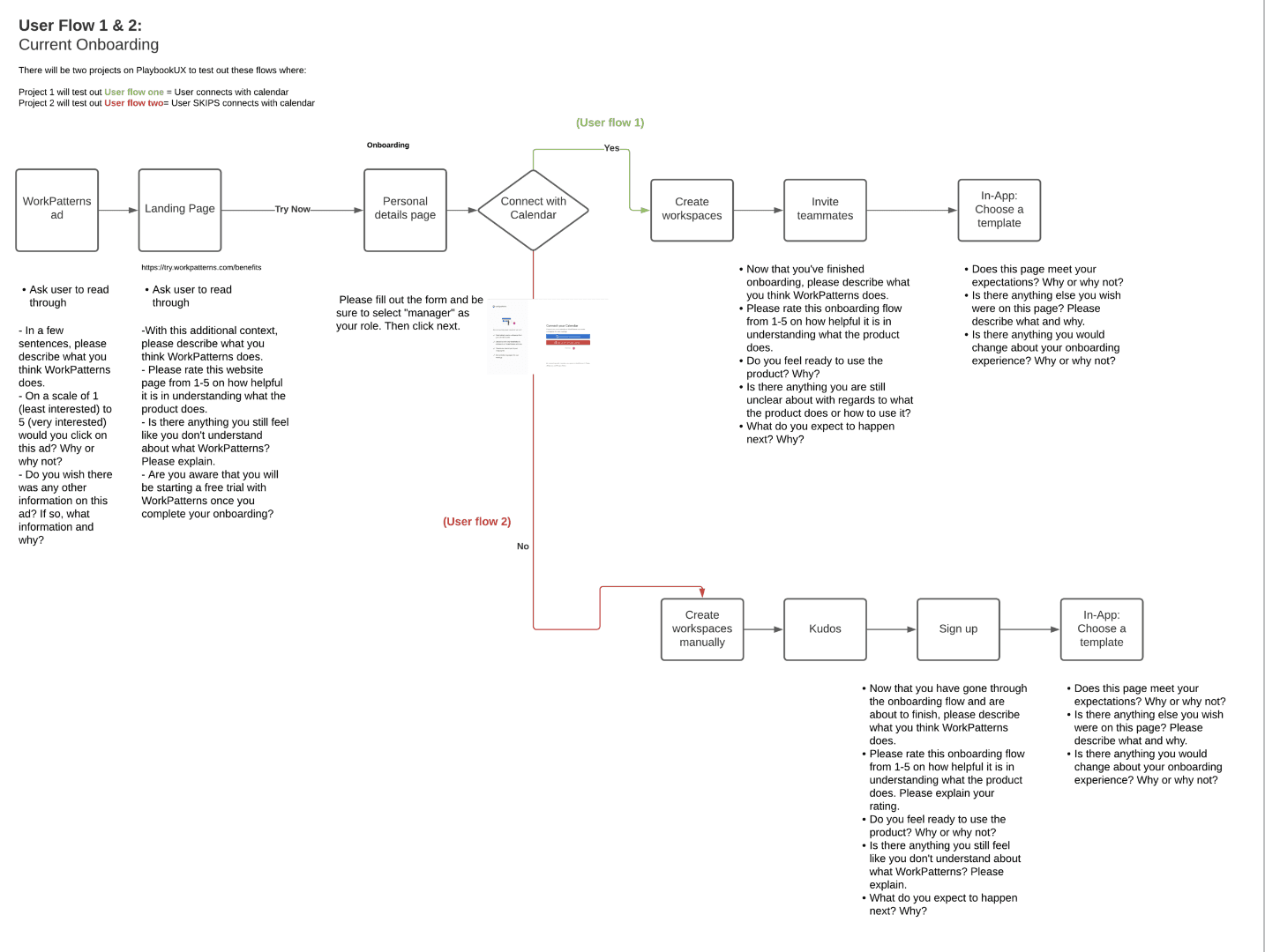
User flow - Current onboarding
Flow chart illustrating the current state of onboarding at the time - identifying what questions should be asked to the user during the research
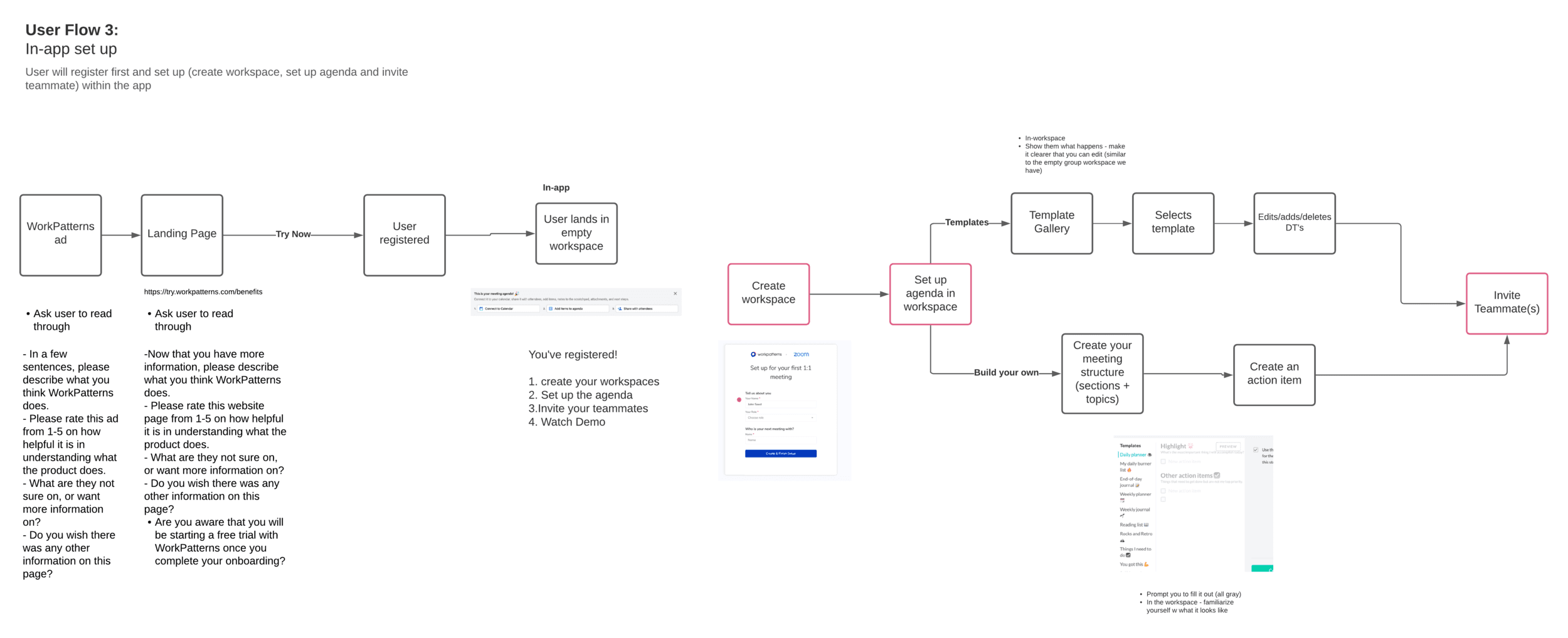
User flow - New proposed onboarding
Flow chart illustrating the new prototype flow based on the hypothesis that came out of a data analysis - identifying what questions should be asked to the user during the research
User research
Methods carried out:
2 PlaybookUX User research studies testing out current onboarding against a mocked up version highlighting some of my hypotheses
A fullstory deep dive in order to gather qualitative data on how our users are navigating through our current onboarding and identify any patterns, fix obvious bugs and help inform next steps
Amplitude chart data deep dive in order to quantitatively inform hypothesis and further research needed
Key Insights:
Users are understanding what WorkPatterns does through the ad and Landing page. However there is inconsistency with the narrative we’re telling and the value prop of WorkPatterns can be introduced earlier on.
All users expect to see some sort of tutorial or educational piece after signing up = "a product walkthrough or something that guides me to understand how to create groups, action items etc. "
However, once user completed in-app set up (prototype), they don't need more than our 3 step set up.
All users were comfortable with signing up without seeing the product because
LP and Ad does a good job of educating the user on WP look/feel (although can be improved with more product imagery)
Stating that they can start with a free trial gives the user comfort to test it out
Language we use is still confusing
Users get the value of the app quicker when their set up is in the app or in a more focused state
Users want the ability to set up multiple workspaces at a time
Invited user flow is unclear
Solution
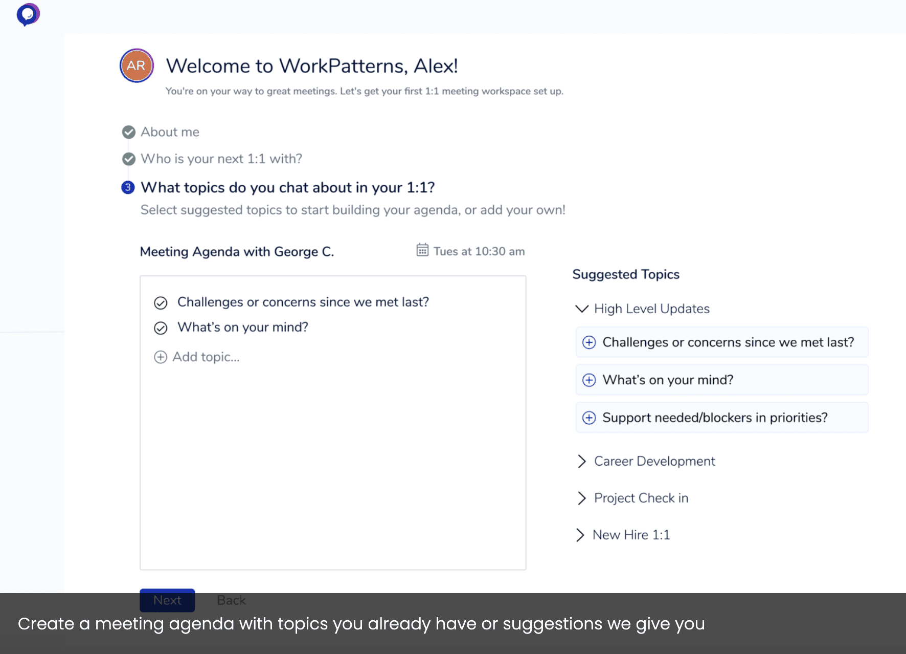
Goal: Create an onboarding experience that felt more in-app and less distracting. Create a trail of steps that the user needs to complete in order to be successful, and added a step of building a meeting agenda to increase probability of activation and retention.
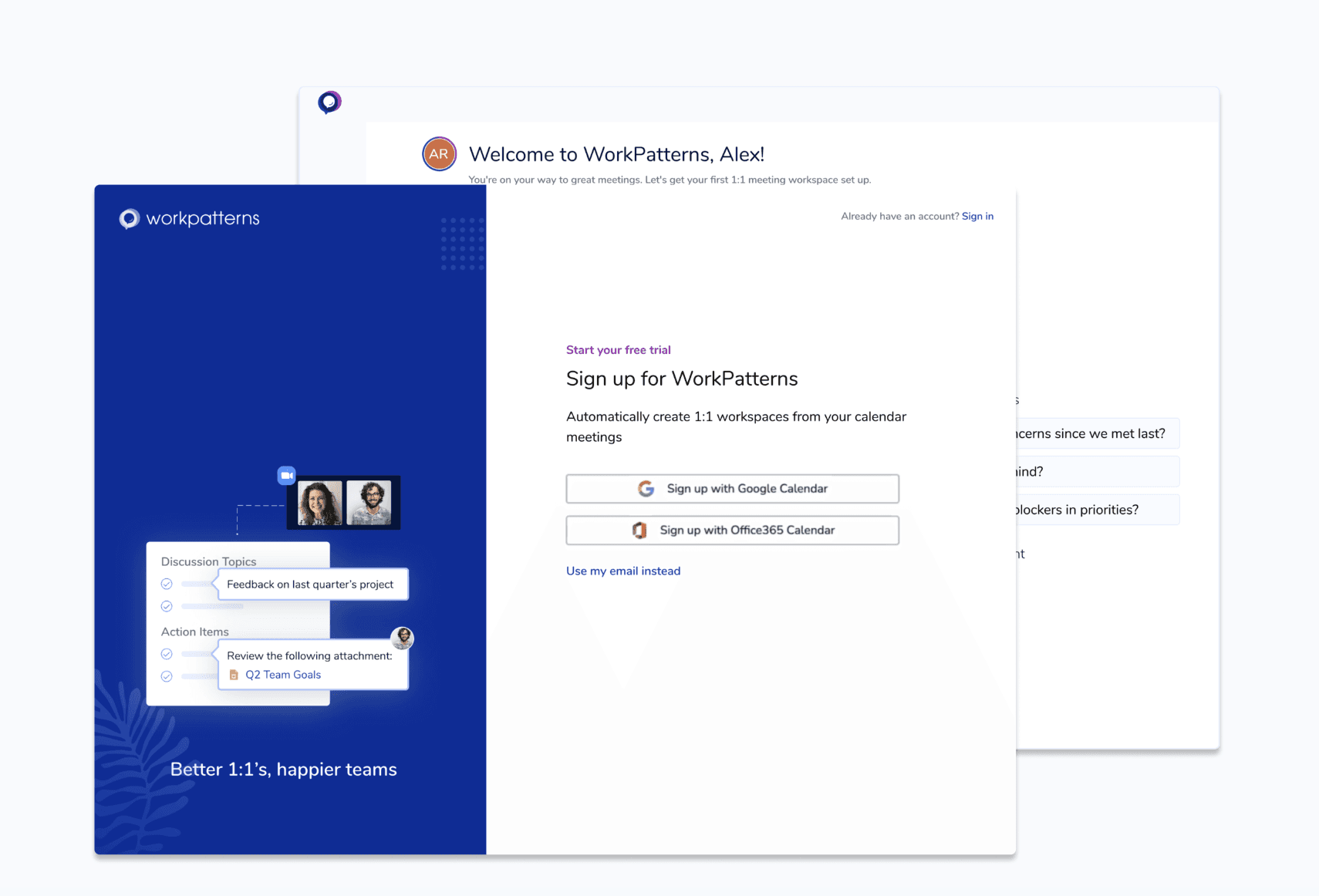
Onboarding
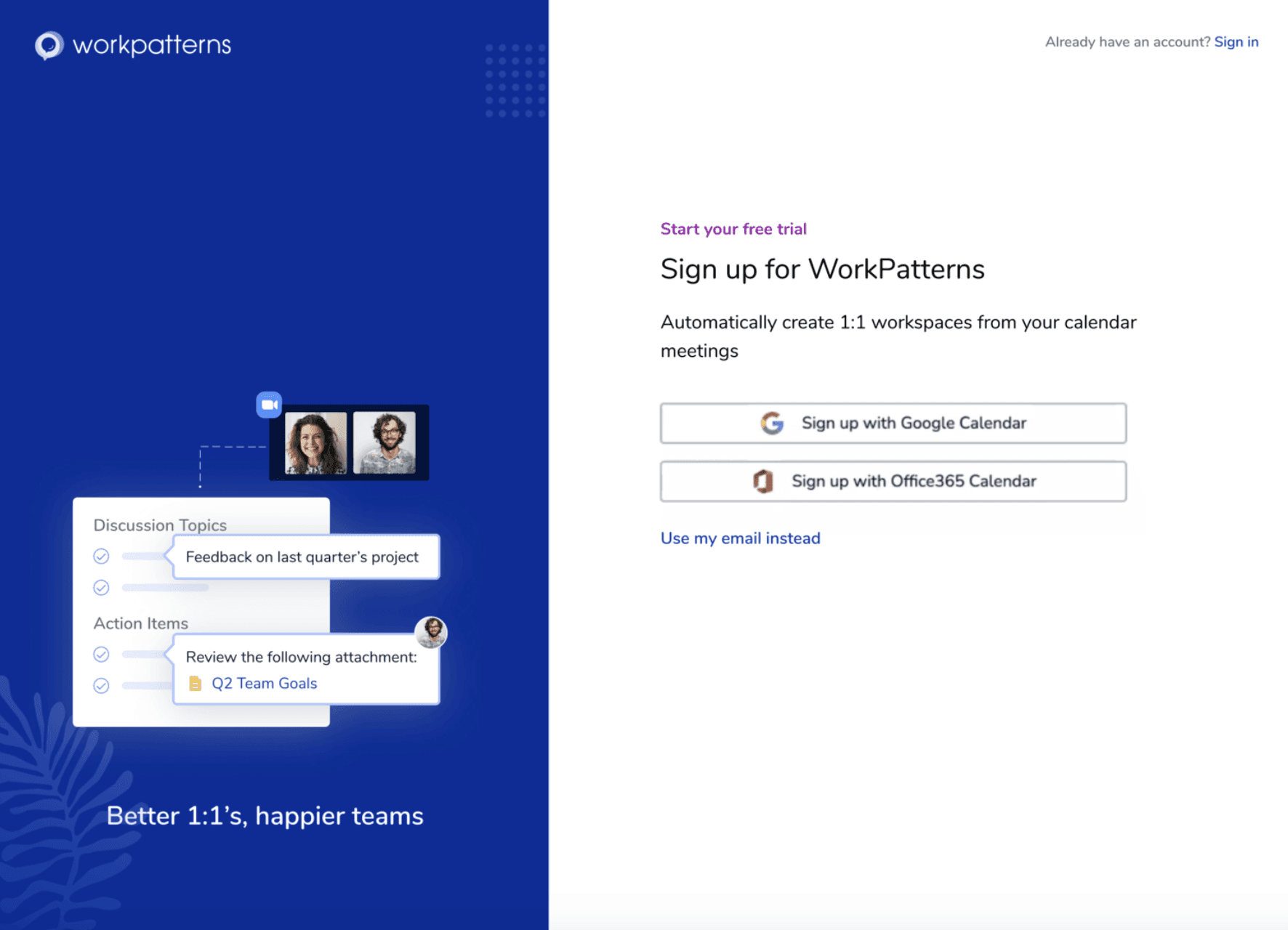


Post signup experience
Goal: To ground the user once they’ve been dropped in the app as well as educate them around the key actions to set up for success and WorkPatterns specific verbiage (e.g. workspaces)


Measurable insights
Metrics moved
Quantitative:
Resulted in 82% of users to invite at least one person during onboarding. Users who invited at least one person are more likely to convert to paid.
Retention rate doubled
Engagement is low but retention is very high
Qualitative:
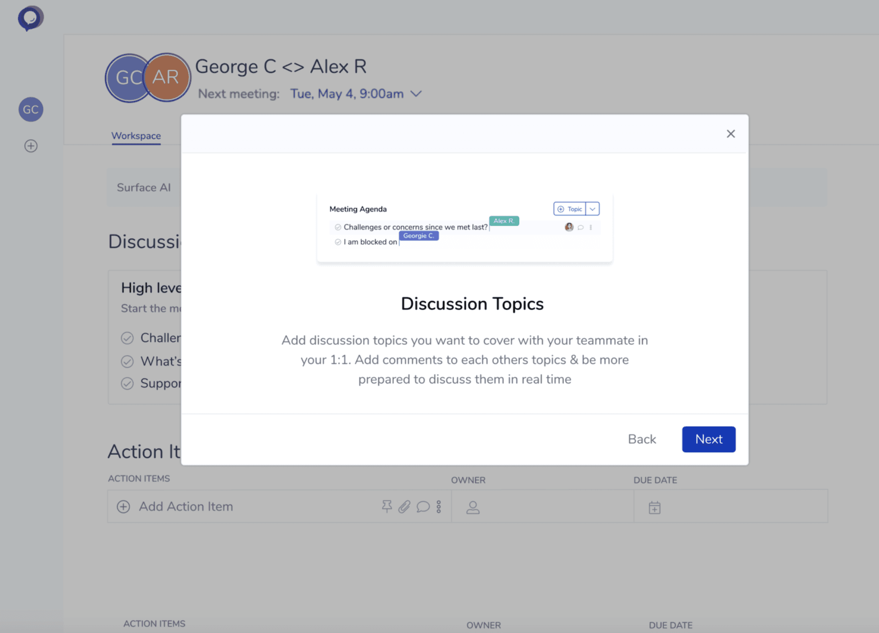
Building an agenda in the onboarding experience educates the user earlier on and pushes the user to invite earlier on as well
Invited user feels more secure entering the platform
The focus on one meeting at a time helped users get to the ‘aha’ moment quicker
©pek.designs 2025